
a study in softness as structure.
brand identity emerging from wool as a method.
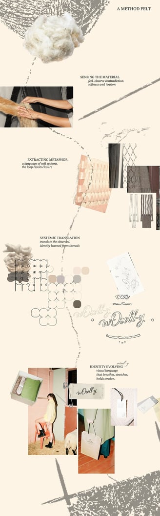
design as a process of unraveling: through felt, metaphor, and gesture.
"wOooll-y" - natural wool garments brand identity & narrative strategy
poetics of process
the narrative and visual identity for w0ooll-y emerged through a slow iterative design process, rooted in material and emotional research.
typography reflects woven, vulnerable rhythm. layouts let the garments breathe.


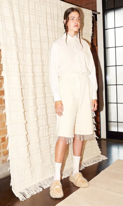
w0ooll-y is a textile brand reclaiming heritage craft through a contemporary, minimal and femenin aesthetic.
w0ooll-y wants to reclaim the meaning of quality, softness, and heritage. it strives to be introspective, melancholic, soft. the brand identity feels quietly confident and — rooted in tradition, yet free of rustic clichés. Instead of following the visual tropes of sustainability or craft, the identity speaks in a calm, nostalgic, dreamy and almost architectural voice: serene, slightly undone, and conceptually precise. elegant and almost too slow.
visual research
material exploration
concept and narrative direction
brand identity design
typographic and layout system
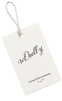
packaging and labeling design
creative direction for visual tone


the market is saturated with textile brands leaning into folklore or minimalist sustainability. neither felt right for wooll-y.
we developed a new narrative language: quiet, emotionally distant, anti-glamour. through careful typography and generous use of space, the story about quality is told, without brand needing to shout. it hints at heritage, tactility, and a restrained dorm aesthetic—without becoming nostalgic.
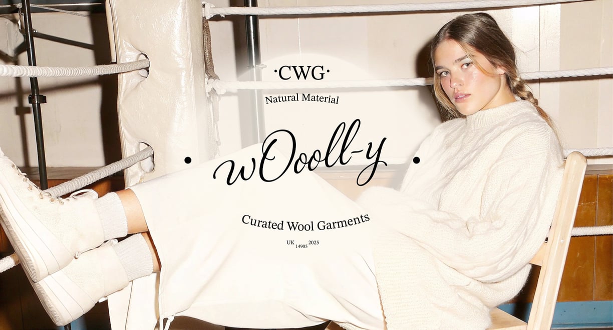
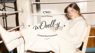

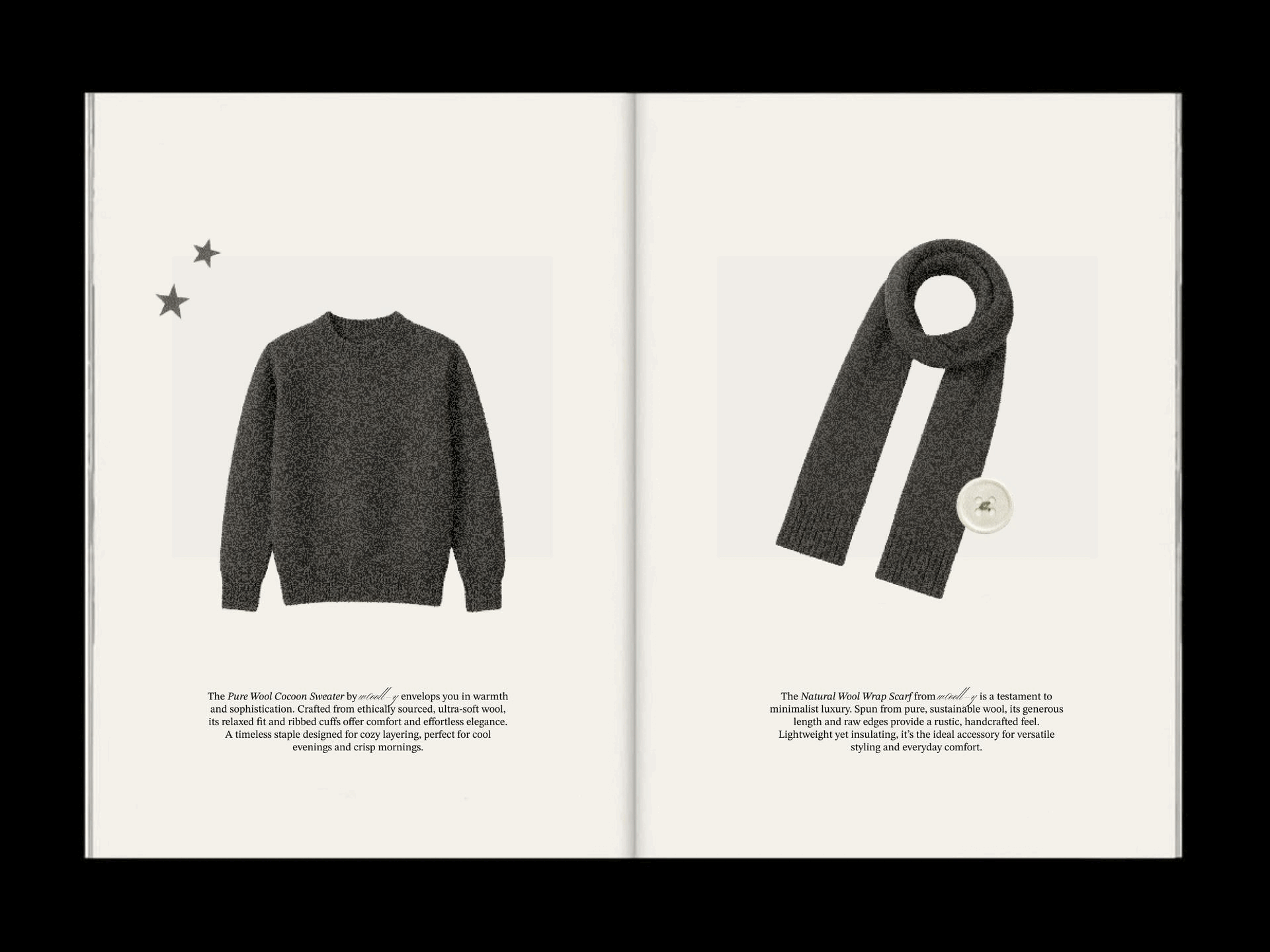
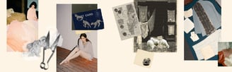
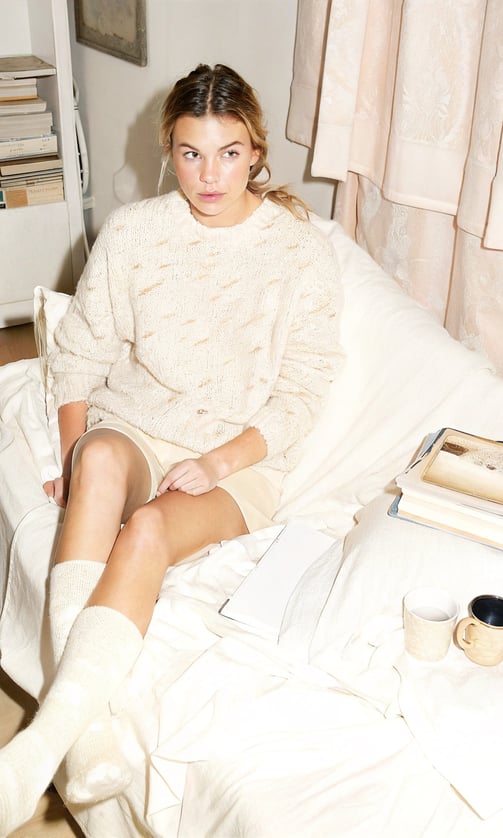
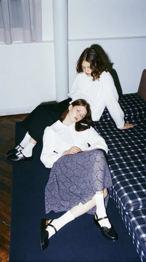
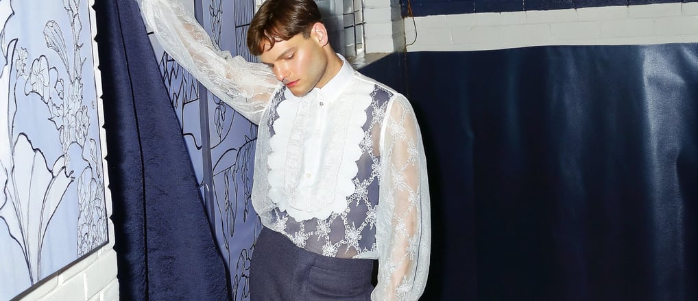
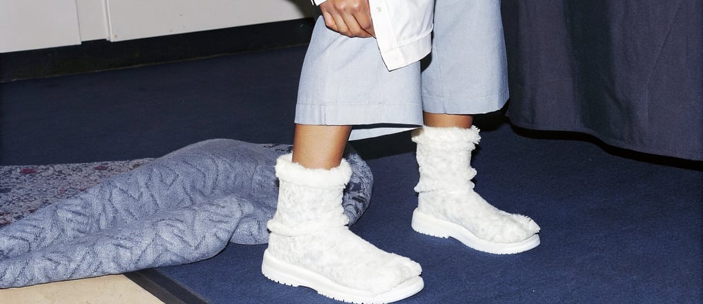
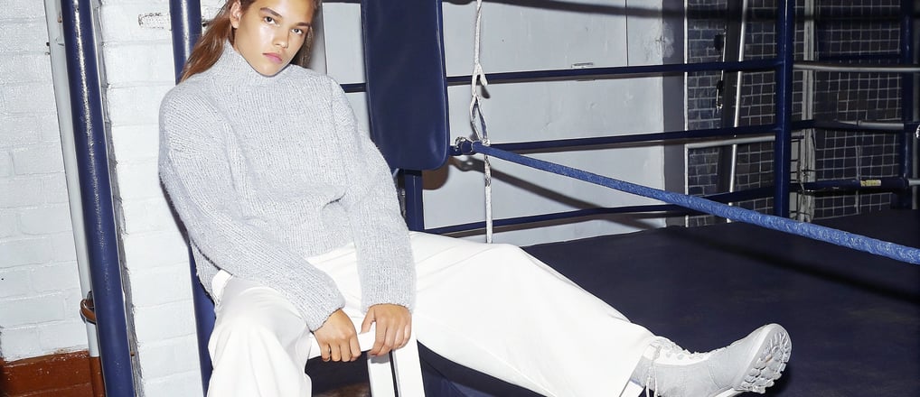
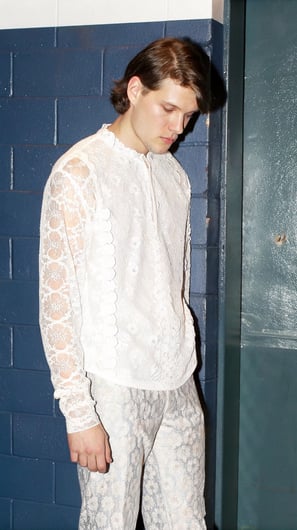
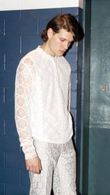
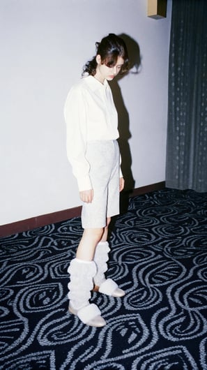
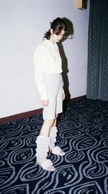
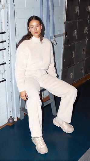
for the launch of w0ooll-y’s new collection, I developed a cohesive visual narrative for digital and physical mediums. alongside the capsule collection catalogue (see above), I generated a series of shoots for the brand’s digital launch campaign—focusing on texture, materiality, and minimal contrast to reflect w0ooll-y’s quiet and intentional aesthetic.
to accompany this, I also designed a hand-drawn launch poster, blending analogue techniques with layered, organic composition.

launch campaign


identity formula
the narrative outcome feels emotionally fragile, but durable by imprint. every label, every space, every word was designed to feel like it belonged to something older—but stayed to live now. w0ooll-y doesn’t shout. it holds presence.
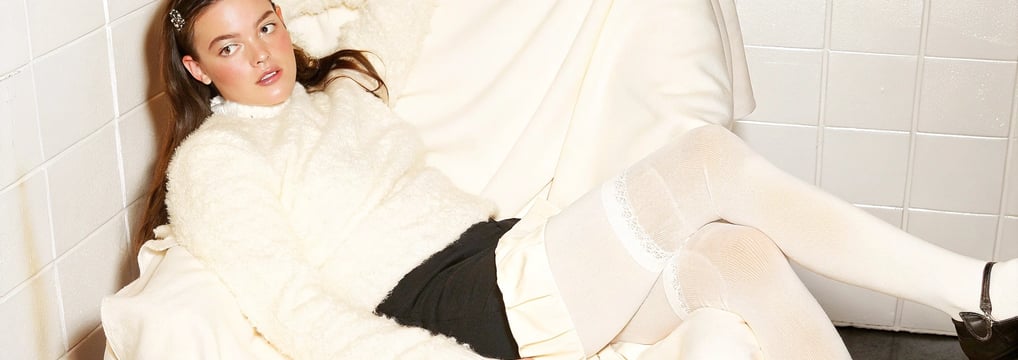
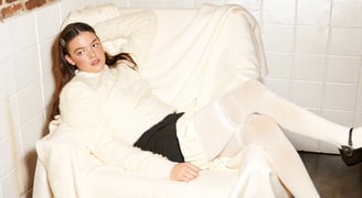
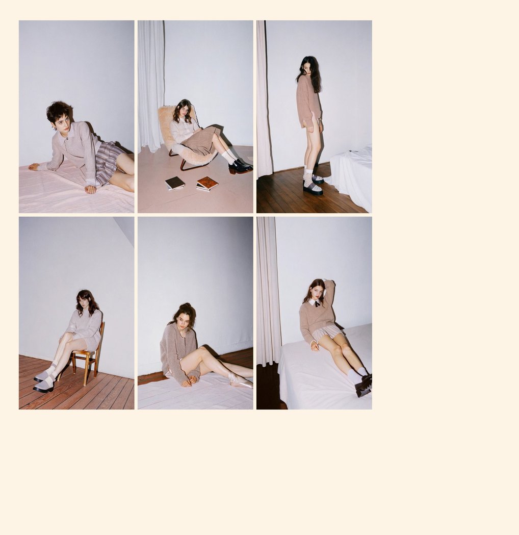
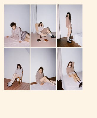
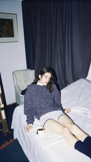
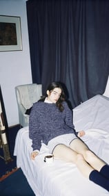
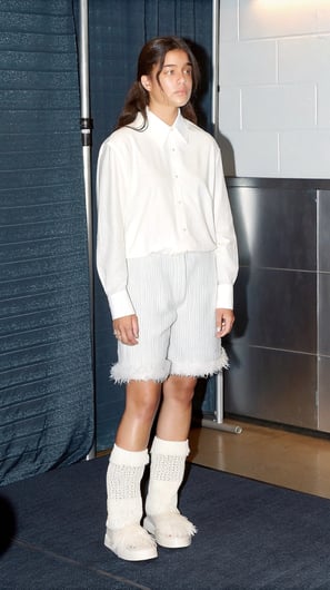

the editorial shoots by w0ooll-y share a raw, but soft detachment. blemishes, fabric creases, and imperfections are present and almost celebrated..
it creates a stark, flat lighting effect that emphasizes textures (skin, fabric, surfaces) and washes out shadows, giving everything a clinical but strangely intimate look. This is a throwback to early 2000s digital camera vibes with posh touch. The models appear still, almost lifeless, either lying down, sitting idly, or mid-adjustment. This evokes vulnerability and quiet introspection.
⋆。𖦹°‧ e-mail: kristina.shantsyna@gmail.com ⋆.◌