
a brand system shaped by vitality and resistance. reimagining menopause through energy, intimacy, and care.
"xbyx - women in balance" branding & visual language design

XbyX empowers women over 40 to take charge of their health and well-being with knowledge, support, and natural solutions. Their mission is to break the stigma around menopause and help women navigate this transformative phase with energy, clarity, and balance. Backed by leading medical experts, XbyX produce plant-based, non-hormonal products tailored to support hormonal balance and healthy aging.


brand strategy
user research
visual identity, concept and narrative direction
brand communication
graphic design system
packaging, digital, event design
visual tone
project management & mentoring
holistic approach

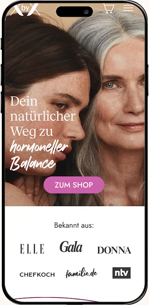
in 2020, addressing menopause in Germany openly, vividly, and without stigma was still a quiet revolution. XbyX set out to rewrite the narrative around healthy aging.
the brand needed to challenge the usual codes of the category.
no sterile medical aesthetics. no muted palettes. no clichés of decline. instead, the vision was to create a space that feels like an invitation to reconnect with age.
a unique visual identity that resonates with the target audience on a deeper level, focusing on positive life approach, high energy and a 'best friend who holds you' feeling.
the developed brand system supports this goal. warm yet bold, science-based yet human. create to celebrate vitality, confidence, and the richness of life beyond 40.
UX/UI design
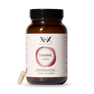
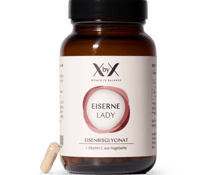
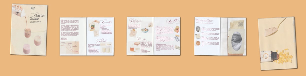
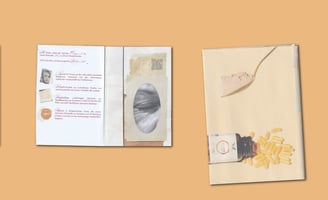
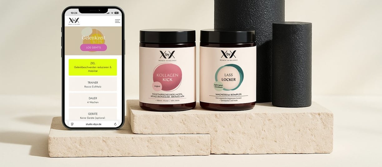
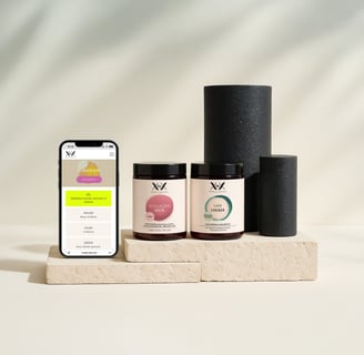
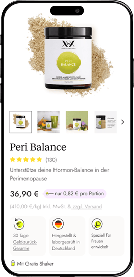
for each new product launched by the XbyX brand, a complete visual system and positioning campaign was developed.
from concept to execution. this includes"
custom packaging design
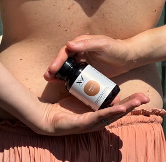
a visual tone tailored to each product
producing digital campaigns that clearly communicate the product’s value across channels.
every visual element is purposefully designed to support the brand’s positioning and narrative.
consistent brand visual language
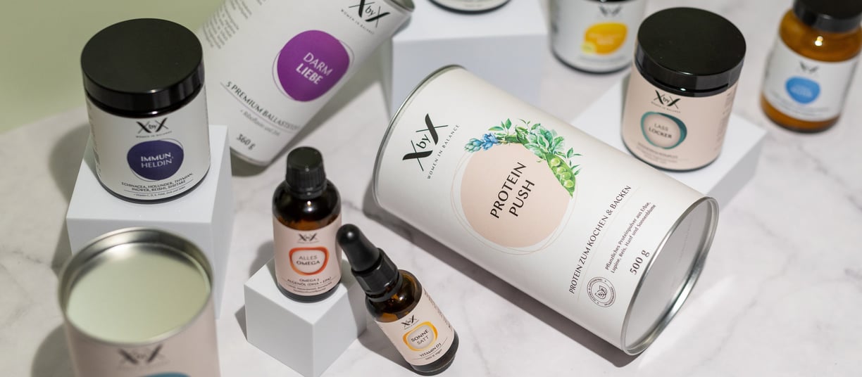
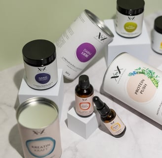
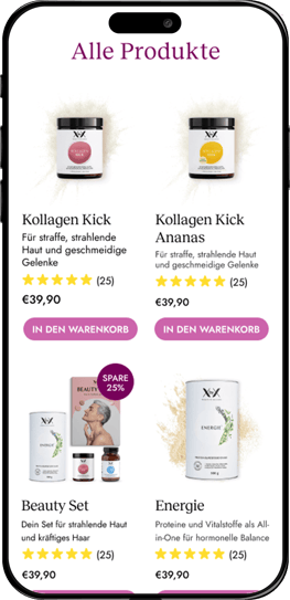
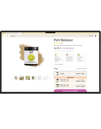
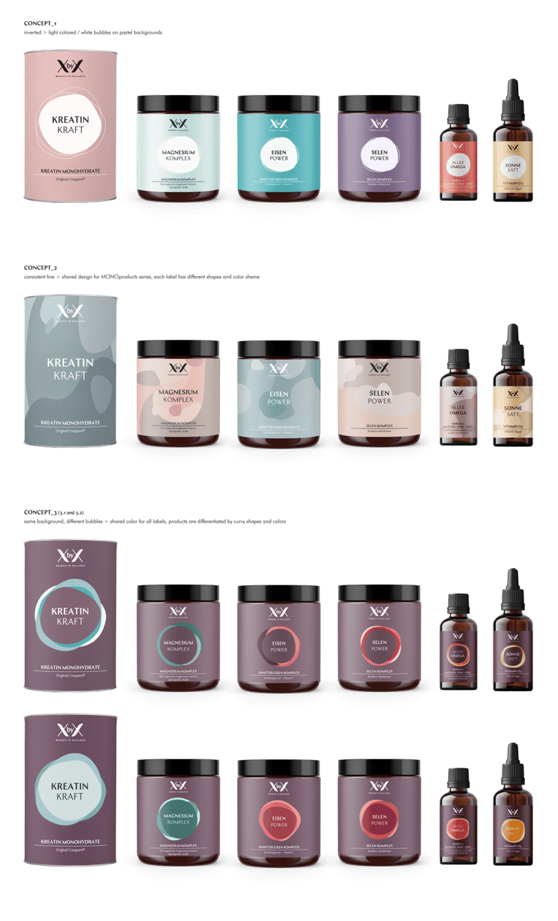
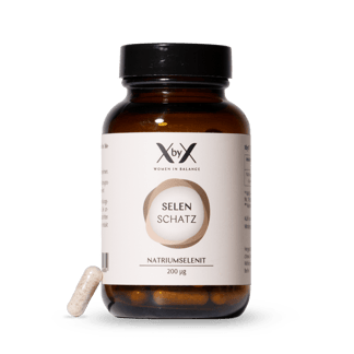
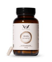
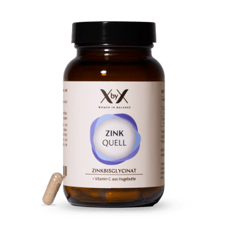
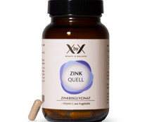
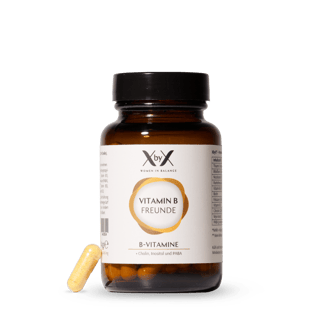
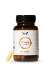
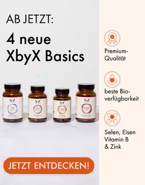
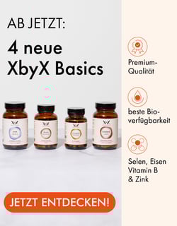
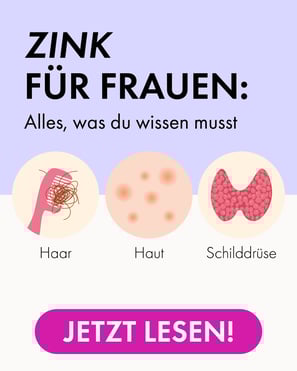
packaging design - Basics
for Basics product line, XbyX set out to redefine how essential supplements - such as zinc and magnesium - are presented.
the concept focuses on simplicity, clarity, and trust. mono-ingredient products as foundational elements for everyday health support.
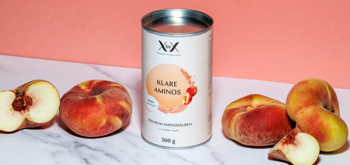
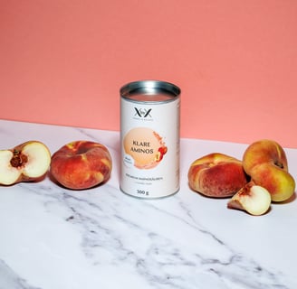
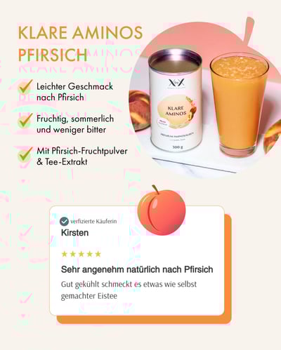

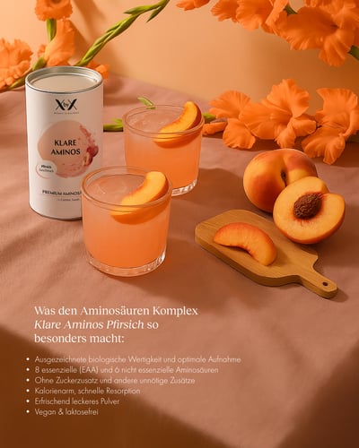
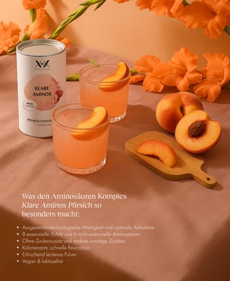
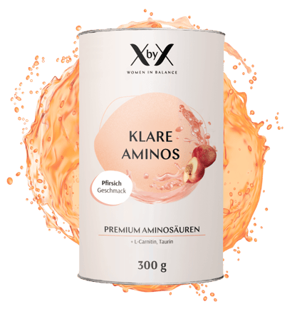
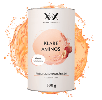
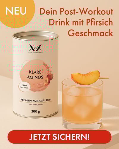
Klare Aminos Peach
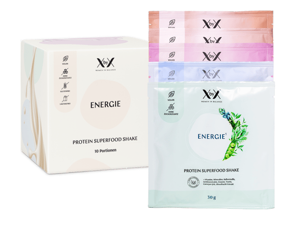
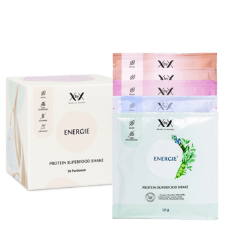
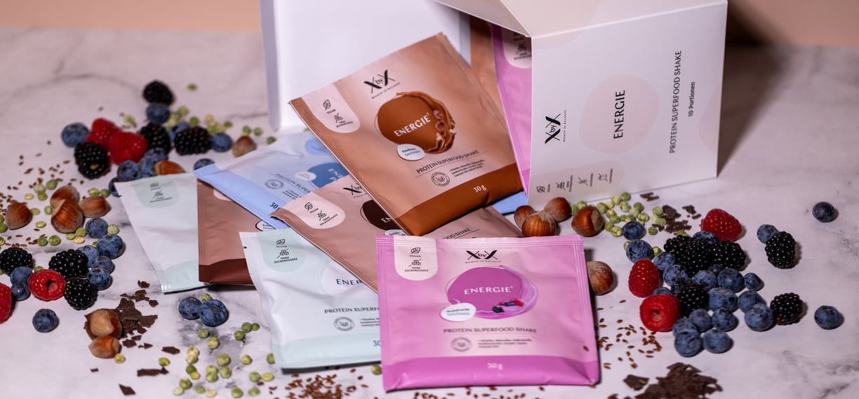
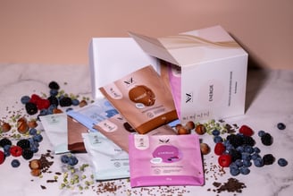
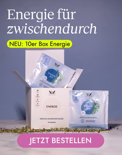
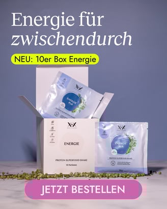
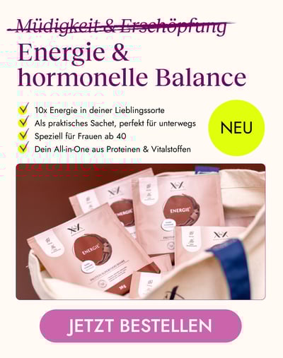
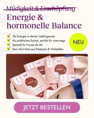
Energie Sachets


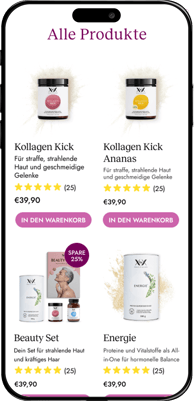
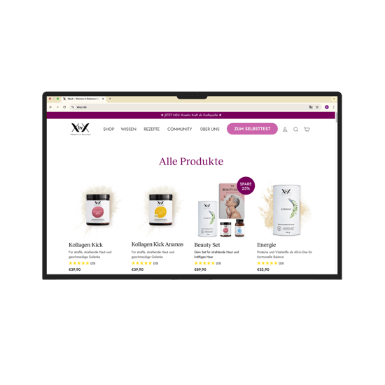
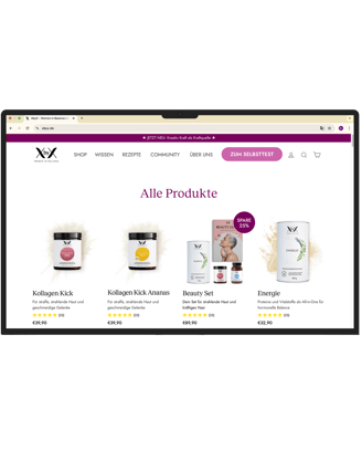
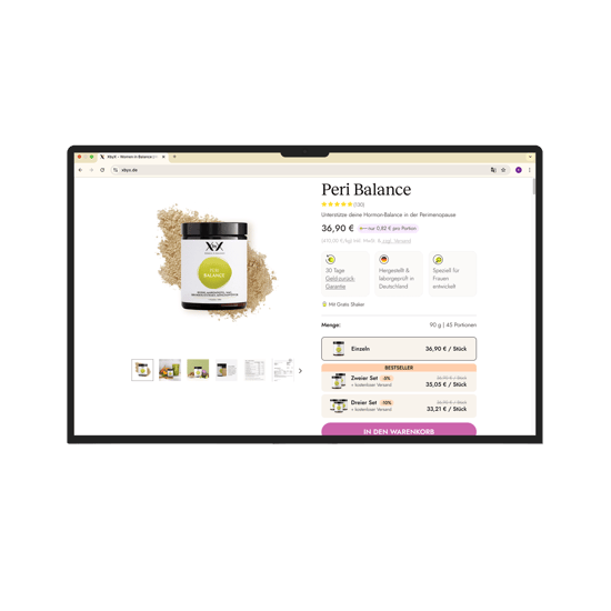
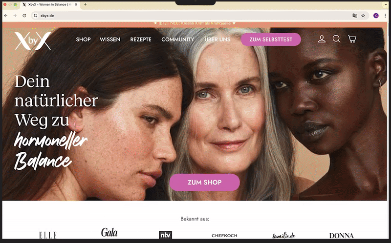
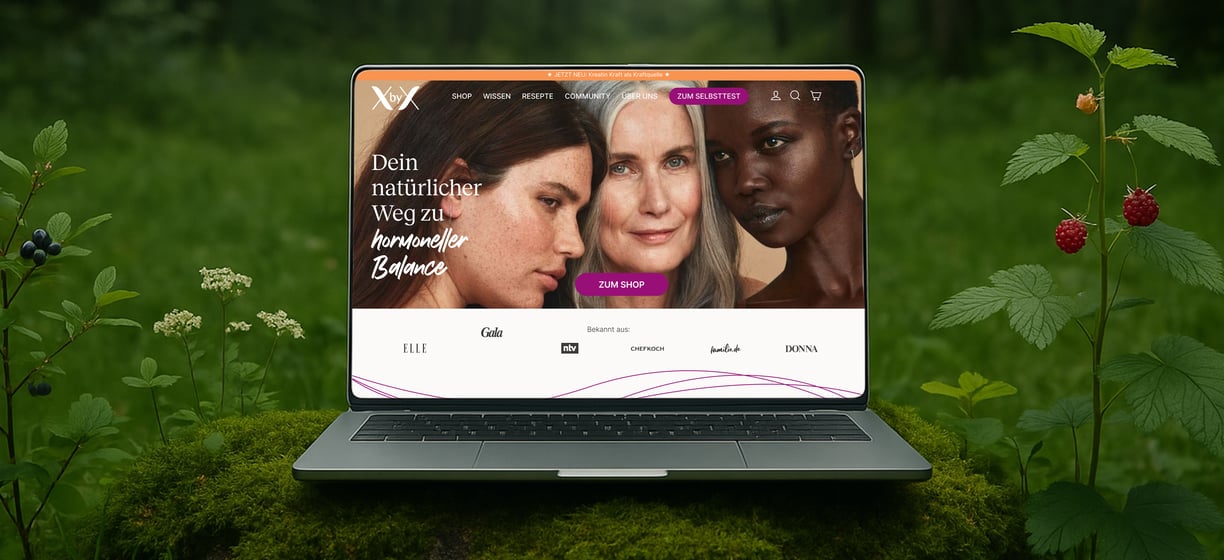
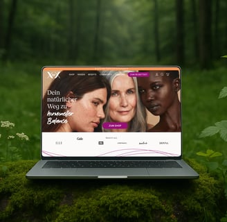
more work on the website - xbyx.de
every visual element & product you will see there is designed by me :)
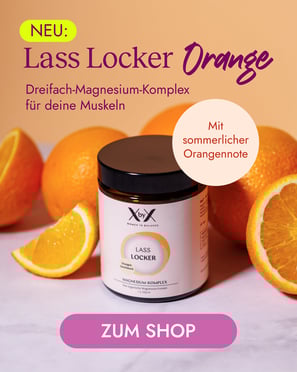
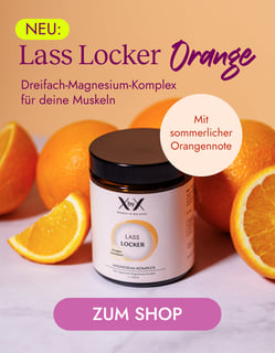
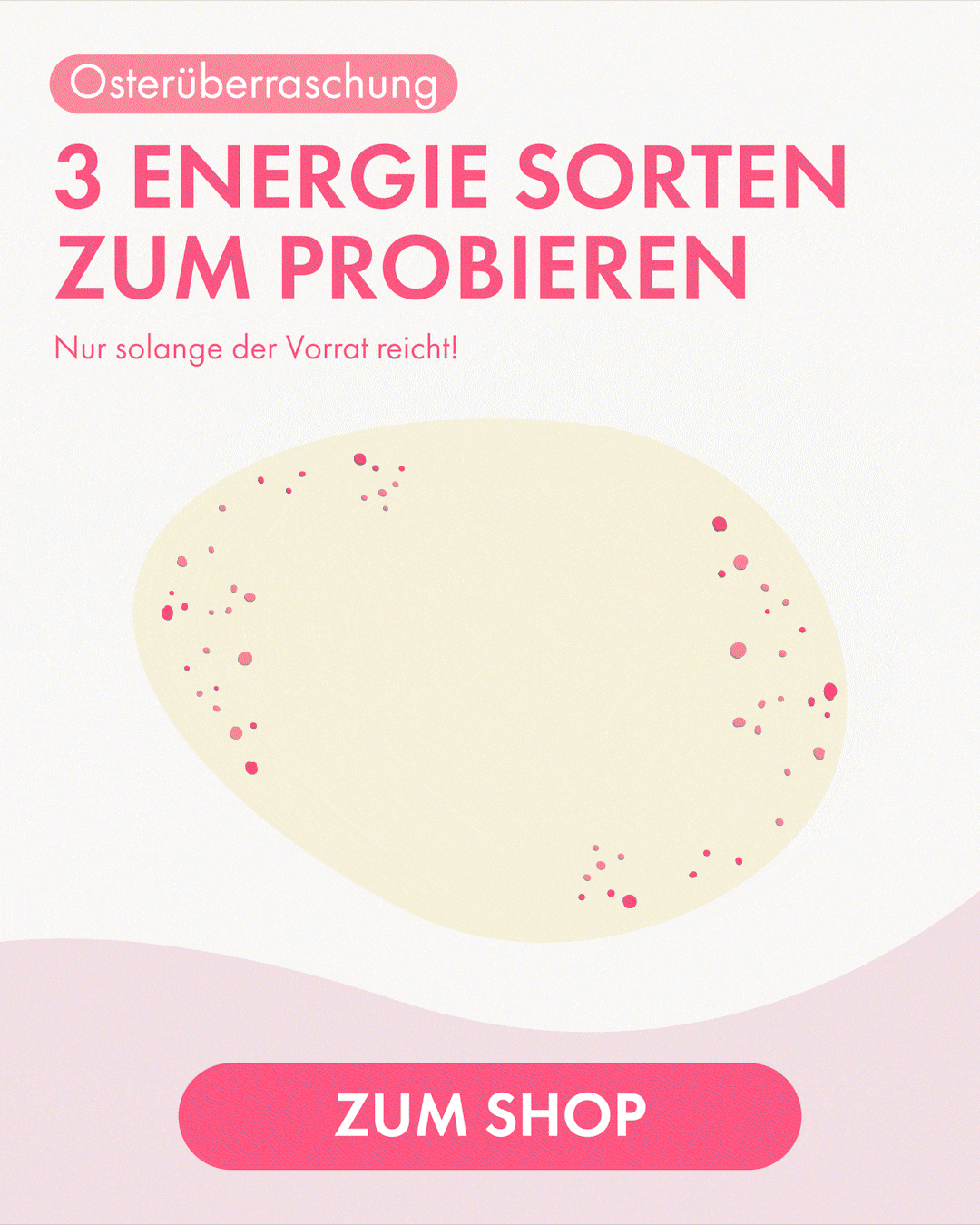
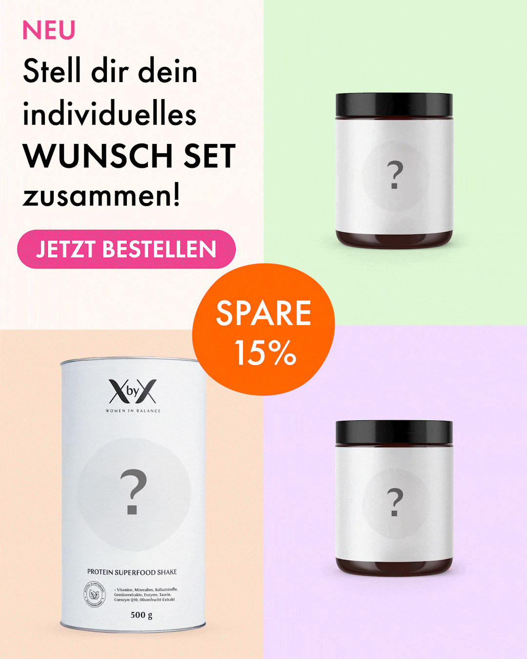
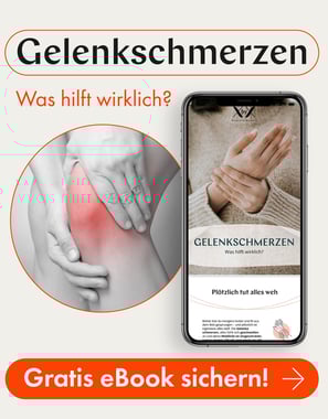
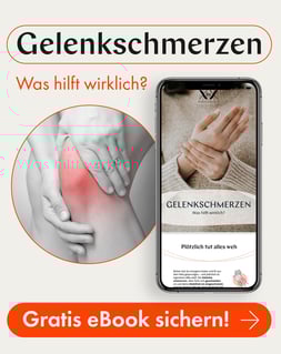
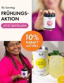
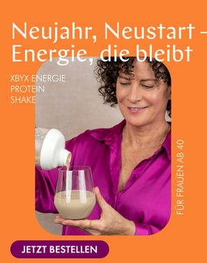
promotional campagnes
as a performance oriented company, XbyX focuses on creation of various visual attention catchers, with high conversion rates.
⋆。𖦹°‧ e-mail: kristina.shantsyna@gmail.com ⋆.◌